Designer · Brand Strategy · Creative Direction 設計師 · 品牌策略 · 創意方向 New Taipei City · Open to roles 新北市 · 開放新機會

Designing brand systems that turn B2B complexity into clarity, alignment, and business value. 用品牌系統設計, B2B 的複雜問題轉成清楚方向、 團隊對齊與商業價值。

Design is my medium. Business impact is my goal. Great brands are built through systems, not isolated campaigns. I am a designer who bridges brand strategy, creative direction, and execution — helping B2B teams turn complex business needs into clear visual systems, communication assets, and digital experiences that can actually ship. 設計是我的媒介,商業影響力是我的目標。好的品牌來自系統,不是一次性的活動。 我是一位橋接品牌策略、創意方向與執行落地的設計師 — 協助 B2B 團隊把複雜商業需求轉化為清楚的視覺系統、溝通素材與真正能上線的數位體驗。

Revenue Impact 商業成果
NT$1M+
Ad revenue led through art direction — ShowDaily Medical Expo, 2019–2021 主導藝術方向支撐 ShowDaily 醫療展年度專刊 — 2019–2021
Recognition 個人獎項
2021
Outstanding Employee Award — Economic Daily News (individual) 經濟日報傑出員工獎(個人獎項)
Range 產業跨度
4 / 13y
B2B sectors directed · Cross-market localization judgment 四大 B2B 產業主導 · 跨市場在地化決策
Scroll 向下捲動
01 / Positioning 01 / 定位

A problem-first designer with brand and business judgment —
built across four B2B sectors, not specialized into one.
一位問題優先的設計師,同時具備品牌與商業判斷 —
跨四個 B2B 產業練成,不被單一產業定型。

I stay close to execution because that is where strategy either survives or breaks. Before designing, I clarify the problem behind the request, the business goal the work should support, the people who need to align, and the system that will keep the idea useful after launch. 我會貼近執行,因為策略最後會在執行中成立或破掉。開始設計之前,我會先釐清需求背後真正的問題、作品要支撐的商業目標、需要被對齊的人,以及什麼系統能讓想法在上線後仍然有用。

01
B2B Publishing B2B 媒體出版
B2B 媒體出版
Economic Daily News
× TAITRA
經濟日報
× 外貿協會
Editorial art direction for export manufacturers. NT$1M+ in ad revenue led through system-level direction across three editions. 外銷台灣製造商的編輯藝術指導。系統級藝術指導橫跨三屆,主導 NT$1M+ 廣告業績。
02
Sportswear
E-Commerce
運動品牌電商
運動品牌電商
SKECHERS
BROOKS
SKECHERS
BROOKS
UNO collection creative direction with full strategy-to-front-end accountability. Brand tone, layout, motion, and live HTML/CSS/JS — one unified art direction. UNO 系列創意方向主導,從策略到前端完整責任歸屬。品牌調性、版面、動態、HTML/CSS/JS 在統一藝術指導下交付。
03
FinTech / Blockchain 區塊鏈金融科技
區塊鏈金融科技
Skycloud
GoEasy Tech
騰雲運算
高易科技
Full UI/UX & Figma Design System for blockchain finance platform. Dual-track core + application system. 區塊鏈金融平台完整 UI/UX 與 Figma Design System,基本系統 + 應用系統雙軌架構。
04
Medical Device 醫療器材
醫療器材
QT Medical 美商宇心生醫
Cardiac monitoring brand visual coordination across global medical conferences (B2B2C multi-stakeholder). 心臟監測醫材品牌全球醫學會視覺統籌,服務 B2B2C 多層決策鏈。
02 / How I Think 02 / 我的思考方式

I think through design,
not around it.
我透過設計思考,
而不是繞開設計。

My strongest work happens when the question is bigger than “make this look good.” I use design craft to make brand thinking visible, testable, and usable by real teams. 當問題不只是「把它做漂亮」時,我通常能發揮得最好。我用設計能力把品牌思考變得看得見、可被討論,也能被真實團隊持續使用。

01

Problem First 問題優先

問題優先

I ask what the request is really trying to solve before deciding what to design. Sometimes the answer is a visual, sometimes it is a system, a hierarchy, or a clearer message. 我會先問這個需求真正想解決什麼,再決定要設計什麼。有時答案是視覺,有時是系統、資訊層級,或一句更清楚的訊息。

02

Business Impact 商業影響力

商業影響力

I care about whether design changes how people understand, decide, buy, align, or trust. Aesthetic quality matters, but it should carry a business purpose. 我在意設計是否改變人們的理解、決策、購買、對齊或信任。美感很重要,但它應該承載一個商業目的。

03

System Thinking 系統思維

系統思維

I try to leave behind something the team can keep using: brand rules, campaign languages, content structures, design patterns, or production habits. 我希望留下團隊能繼續使用的東西:品牌規則、活動語言、內容結構、設計模式,或更順的製作習慣。

04

Collaboration 跨部門協作

跨部門協作

I work best with planners, marketers, engineers, stakeholders, and other designers. My job is often to make the shared direction concrete enough for everyone to move. 我適合和企劃、行銷、工程、業主與設計團隊一起工作。很多時候,我的工作是把共同方向具體化到大家都能往前推進。

03 / Selected Work 03 / 代表案例

Four projects, four commercial outcomes. 四個案例,四個商業成果。

Each case shows how design decisions were shaped by business context: what needed to change, what I saw, how I translated it into a visual system, and what the work made possible. 每個案例都說明設計決策如何被商業情境影響:什麼需要被改變、我看見什麼、如何把它轉化成視覺系統,以及作品最後讓什麼變得可能。

01
Brand Strategy品牌策略 Creative Direction創意方向 Digital Experience數位體驗 Localization在地化

Repositioning a classic sneaker line
through emotional differentiation.
情感差異化
重新定位經典鞋款系列。

SKECHERS UNO 電商行銷 — 從受眾定位到創意方向與數位體驗
2022 — 2023 · SKECHERS Taiwan 2022 — 2023 · 思克威爾股份有限公司
View live brand experience 查看上線品牌體驗
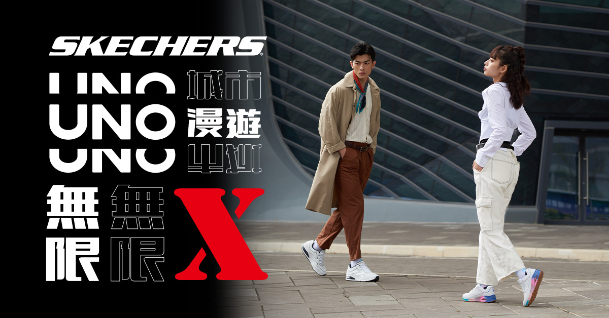
SKECHERS UNO Key Visual — 城市漫遊 / 無限 X collection

Problem問題

UNO needed to feel distinct inside the SKECHERS portfolio. The business problem was not only visual differentiation; it was helping a classic sneaker line speak to younger consumers without being pulled back into SKECHERS' familiar comfort-performance image. UNO 需要在 SKECHERS 品牌矩陣中被看見。真正的問題不只是視覺差異化,而是讓一個經典鞋款系列能對年輕消費者說話,同時不被拉回 SKECHERS 既有的舒適機能印象。

Insight & Strategy洞察與策略

Worked with the planning team to translate the audience insight into a campaign language. Instead of following the category's retro-athletic or urban-casual codes, I built the direction around hand-drawn typography and diary-like warmth — a visual choice that made the product feel more personal, local, and emotionally closer to the target audience. 我與企劃團隊一起把受眾洞察轉成活動語言。 沒有沿用鞋款常見的復古運動或都會休閒語彙,而是以手寫字體與日記感溫度作為方向,讓產品更個人、更在地,也更接近目標族群的情感語境。

Why direction-and-execution unity matters 為什麼方向與執行的一體化重要

Because I also handled the landing page execution, the campaign idea did not stop at a key visual. Typography, motion timing, hover states, and layout rhythm were carried into the live experience without losing the emotional tone of the concept. 因為我同時負責 Landing Page 執行,這個活動概念沒有停在主視覺。字體、動態 timing、hover 狀態與版面節奏都被帶進實際上線體驗,沒有在交接過程中失去原本的情感調性。

Solution / Impact解法 / 影響

  • Created a differentiated campaign language for UNO, giving the collection a warmer emotional territory across e-commerce, retail, and social touchpoints. 為 UNO 建立差異化的活動語言,讓系列在電商、店頭與社群接觸點中擁有更具情感溫度的品牌領域。
  • Direction-and-execution unity from design file to live front-end — full creative accountability, no detail lost in handoff. 方向與執行一體,從設計稿到前端上線 — 完整創意責任歸屬,品牌細節無妥協。
  • Reusable campaign assets helped keep the collection coherent beyond a single launch moment. 可重複使用的活動資產讓 UNO 系列在單次上市之外仍能維持一致溝通。

Future Direction (if revisiting in 2026) 未來方向(假設 2026 年重啟)

The 2022 hand-drawn diary aesthetic established UNO's emotional differentiation — but the audience has aged with the brand. The next-season direction I'd propose: preserve the hand-drawn aesthetic as UNO's brand anchor, but split the visual language by generational reading: 2022 年的手寫日記美學成功建立 UNO 的情感差異化 — 但客群已隨品牌一起變老。下一季我會提的方向:保留手寫美學作為 UNO 的品牌錨點,但依世代解讀切分視覺語法:

  • 25–30 segment: lean further into individuality and lo-fi expression — looser hand lettering, candid layouts. 25–30 歲族群:加深個性與 lo-fi 表達 — 更鬆散的手寫筆觸、更直覺的版面。
  • 30–44 segment: refined hand-drawn vocabulary — more deliberate strokes, tighter typographic discipline, premium paper textures. 30–44 歲族群:精煉的手寫語彙 — 更刻意的筆觸、更收束的字體紀律、紙張質感升級。

The principle: a brand language that ages with its audience without alienating new entrants. 核心原則:讓品牌語言隨客群一起成熟,但不會排擠新加入者。
02
Brand Repositioning品牌再定位 VIS SystemVIS 規範 Stakeholder Alignment決策對齊

Modernizing market perception
without breaking 30 years of trust.
更新市場認知,
但不破壞三十年的信任資產

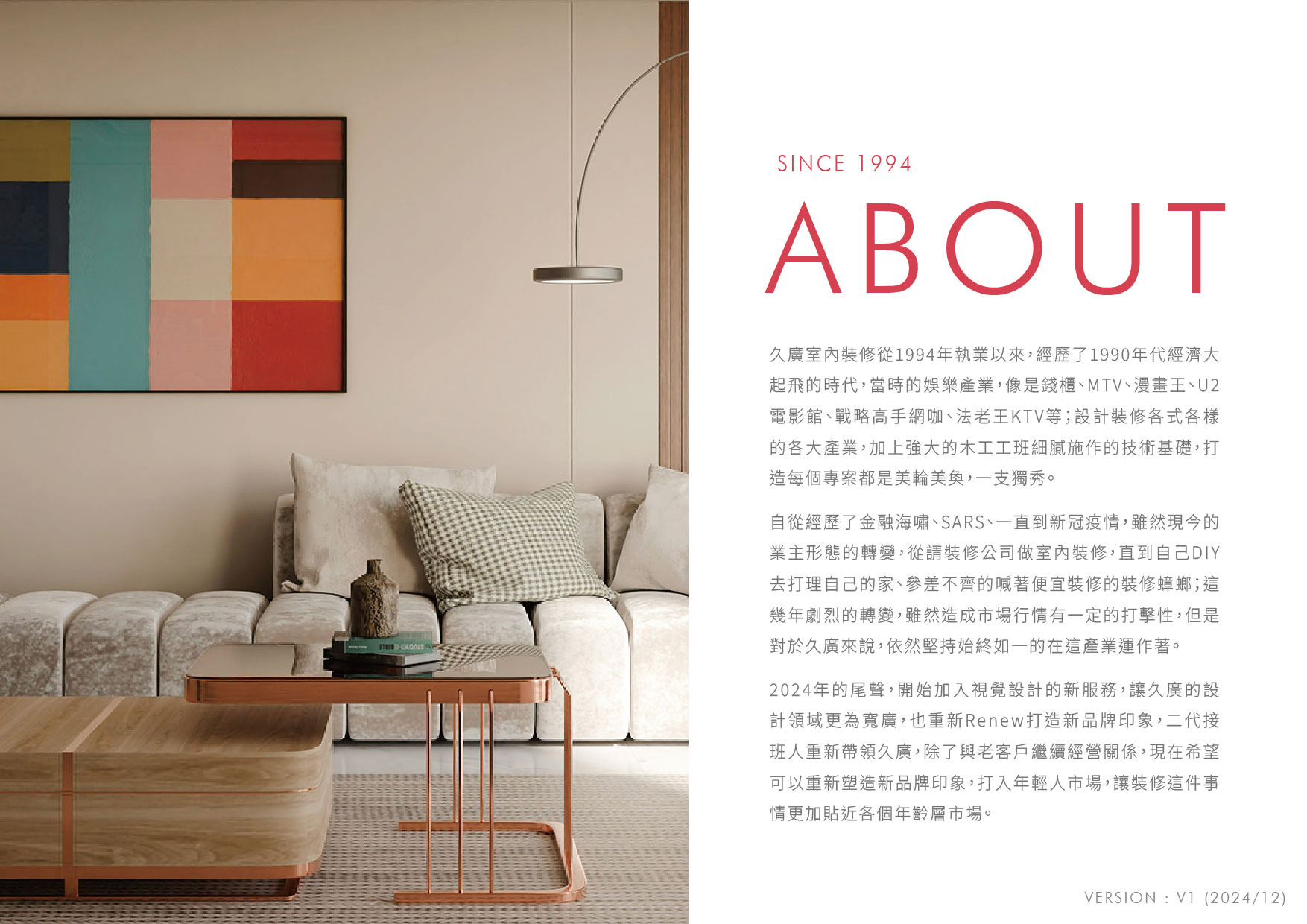
久廣室內裝修 — 30 年 B2B 工程承包商品牌再定位與數位重塑
2025 — Present · Geocan Design Co., Ltd. 2025 — 至今 · 久廣室內裝修有限公司

Problem問題

A 30-year, family-led B2B contractor serving developers, commercial spaces, and entertainment venues — built on three decades of contractor-grade trust. But the brand visual hadn't kept pace, increasingly out of step with how a new generation of B2B clients evaluate contractors. Modernize the brand without losing the trust signals that drive their decisions. 一家 30 年家族經營的 B2B 工程承包商,服務建商、商業空間、娛樂產業客戶 — 三十年累積的承包商級信任是核心資產。但品牌視覺並未隨之進化,與新世代 B2B 客戶評估承包商的方式逐漸脫節。現代化品牌,但不能失去客戶做決策時依賴的信任訊號。

Insight & Strategy洞察與策略

Led creative direction in close partnership with the client principals — three decisions framed and defended through stakeholder workshops: 與業主決策層緊密協作主導創意方向 — 三個關鍵決策透過業主工作坊框架並辯護成立:

  • Anchored the trust core. Legacy logo concept retained as the brand's structural anchor. 錨定信任核心。 Logo 概念保留作為品牌結構性錨點。
  • Directed against the category convention. Most competitors over-corrected toward editorial, design-magazine aesthetics. For a contractor whose clients evaluate on technical reliability, that direction undermines trust. I directed the visual system the other way: warm, grounded, modern but not editorial. 反向定調同業慣例。 多數同業已過度修正,走向編輯感、設計雜誌風格。對一個客戶以「工程可靠度」評估的承包商,這個方向會傷害信任感。我將視覺系統反向定調:溫暖、紮實、現代但不文青。
  • Set function before flourish as the creative principle. Spaces are for living and working, not for being photographed. The visual system reflects that — solving problems over chasing trends. 將「實用優先,華麗其次」訂為創意原則。 空間是給人生活與工作的,不是給人拍照的。這個視覺系統反映這個哲學 — 解決問題大於追逐趨勢。

Solution / Impact解法 / 影響

  • Created the company's first comprehensive brand asset and external communication system, turning tacit trust into a visible decision signal. 建立公司首次完整的品牌資產與對外溝通系統,把隱性的信任累積轉化為可被看見的決策訊號。
  • Authored complete VIS guidelines across 4 dimensions — color system, typography hierarchy, logo applications, and visual standards documentation. Designed to be operable by future internal or contracted designers without my involvement. 撰寫完整 VIS 規範橫跨四大層面 — 色彩體系、字體階層、Logo 應用、視覺規範文件化。設計成未來內部或外包設計師可獨立操作,不依賴我本人。
03
Product Strategy產品策略 Design System設計系統 Branding品牌 Scalable System可擴充系統

Building product trust through
scalable brand-system logic.
可擴充的品牌系統邏輯
建立產品信任。

騰雲運算 — 區塊鏈金融平台品牌與產品體驗系統
2023 — 2024 · Skycloud Co., Ltd. 2023 — 2024 · 騰雲運算股份有限公司
03
Figma Design System · Web + Mobile UI Figma 設計系統 · 區塊鏈平台 UI
Internal product · visual proxy shown. Full Figma system available on request. 內部產品 · 顯示視覺代理。完整 Figma 系統可應要求提供。

Problem問題

The platform needed more than interface screens. It needed a product experience that could make blockchain finance feel credible, understandable, and expandable as the business prepared for future product lines. 這個平台需要的不只是介面畫面,而是一套能讓區塊鏈金融產品看起來可信、可理解,並能支援未來產品線擴展的產品體驗。

Insight & Strategy洞察與策略

I treated the design system as product infrastructure. The structure separated core brand rules from application patterns, so the team could keep the experience consistent while adapting it across web, mobile, and future products. I partnered with engineering to keep the system practical, not just visually complete. 我把設計系統視為產品基礎建設。 架構上區分核心品牌規則與應用模式,讓團隊在 Web、手機與未來產品中保持一致,也能彈性延伸。我與工程協作,確保系統不只是視覺完整,而是真的可實作。

Solution / Impact解法 / 影響

  • Established complete corporate visual identity for two parent-group companies (Skycloud and GoEasy Tech). 建立集團兩家子公司(騰雲運算 + 高易科技)的完整企業視覺識別。
  • System architecture improved downstream iteration speed and made product decisions easier to align across design and engineering. 系統架構提升後續迭代速度,也讓設計與工程之間的產品決策更容易對齊。
  • Scalable design asset library — lowering the threshold for future product development. 可規模化的設計資產庫,降低未來新產品開發門檻。
04
B2B Communication StrategyB2B 溝通策略 B2B BrandingB2B 品牌 Visual System視覺系統 Cross-Functional Leadership跨職能領導

Turning editorial credibility into
advertiser-facing value.
把編輯公信力轉化為
面向廣告主的價值

ShowDaily 醫療展年度專刊 — B2B 出版商業模式下的內容與廣告價值設計
2019 — 2021 · Economic Daily News × TAITRA 2019 — 2021 · 經濟日報 × 外貿協會
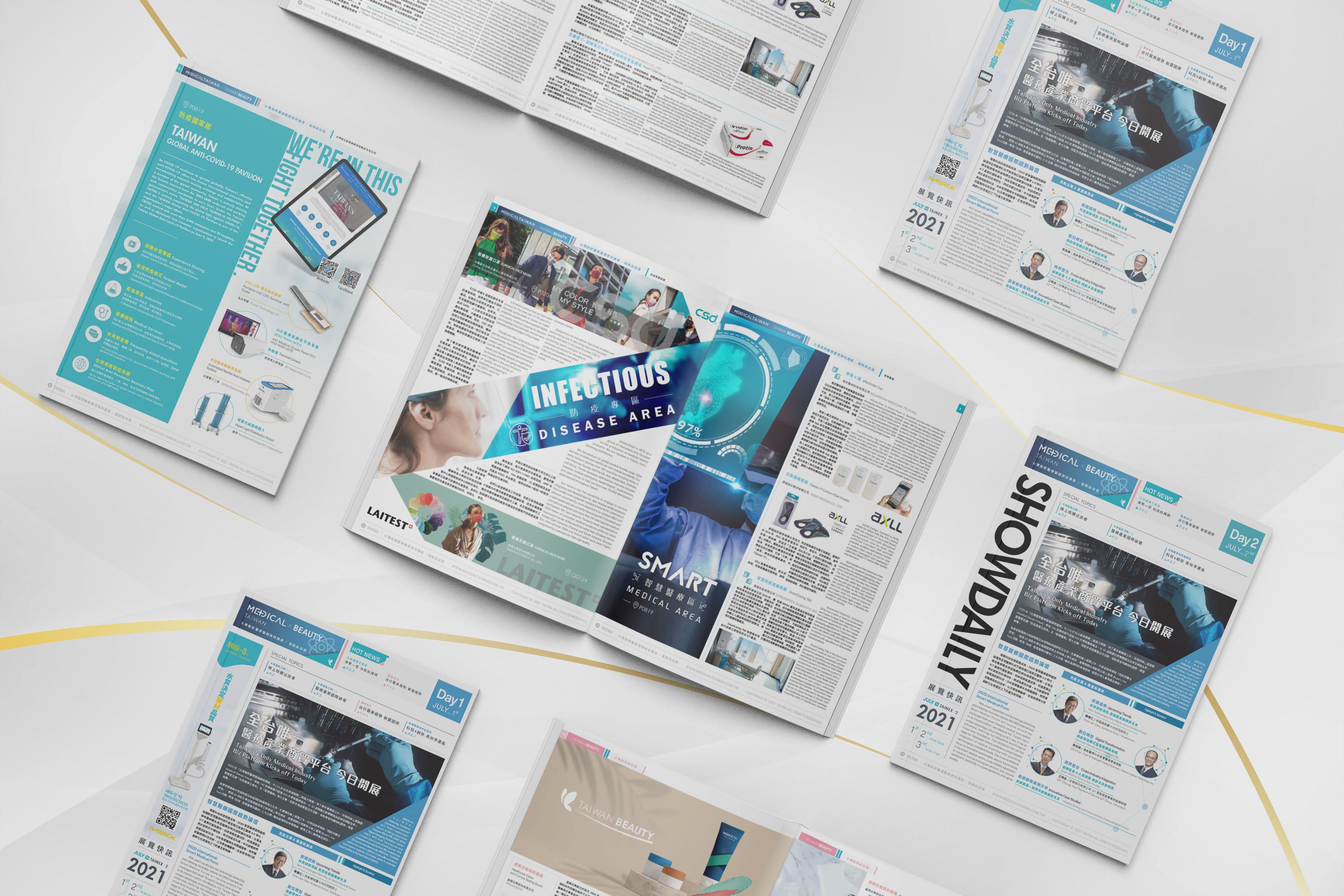
ShowDaily Medical Expo Annual Magazine — multi-edition editorial system across Day 1 / Day 2 (2019–2021, Economic Daily News × TAITRA)

Problem問題

Direct an international medical expo magazine for the Taiwan External Trade Development Council that would actively attract advertisers — balancing the rigorous authority demanded by the medical industry with the visual appeal that drives ad placement decisions. The structural tension: too clinical and advertisers see no value in being there; too commercial and the publication loses the institutional credibility that makes the placement worth paying for. Three consecutive editions had to hold the line. 主導為外貿協會打造國際醫療展會專刊的藝術方向 — 在醫療產業要求的權威感與驅動廣告下單的視覺吸引力之間取得平衡。結構性張力:過於臨床,廠商看不到刊登價值;過於商業,專刊失去讓廠商願意付費刊登的機構公信力。 連續三屆都要守住這條線。

Insight & Strategy洞察與策略

Led the visual response across three consecutive editions — owning the art direction while orchestrating a cross-functional editorial pipeline spanning journalists, translators, and front-end engineers. 連續三屆主導視覺方案 — 握有藝術方向決策權,同時編排橫跨記者、翻譯、前端工程師的跨職能編輯流程

  • Led art direction at the system level. Defined the visual language at the cover-and-key-visual level, then cascaded it downward into a consistent inner-page editorial grid that any team member could operate within. 系統層級主導藝術方向。 從封面與主視覺定調視覺語言,向下層層落實為一致的內頁編輯網格,團隊任何成員都能在系統內運作。
  • Built a replicable cross-functional pipeline. Partnered with journalists and translators to build an editorial workflow that survived staff turnover and edition-to-edition cadence — the system, not any single person, owned the production quality. 建立可複製的跨職能流程。 與記者、翻譯共構編輯流程,讓流程能跨越人員流動與版次節奏 — 製作品質由系統負責,而非任何單一個人。
  • Calibrated international expo standard for local readability. Layouts directed to the visual register of international medical exhibitions, while preserving the reading comfort that determines whether attendees actually pick the magazine up at the booth. 校準國際展會標準至在地閱讀友善度。 版面對齊國際醫療展視覺水準,同時保留決定「現場是否被取閱」的閱讀舒適度。
  • Mentored junior designers into the system. As junior team lead, onboarded incoming designers into the editorial system and managed front-end engineering project timelines — extending the art direction beyond what one person could ship. 將 junior 設計師帶入系統。 作為單位小主管,協助新進設計師上手編輯系統,並管理前端工程師專案進度 — 將藝術方向延伸至超越單人產出的範疇。
Why this matters in B2B publishing 為什麼這在 B2B 出版語境中重要

In trade-show publishing, the magazine is the product — but the customer is the advertiser, not the reader. A magazine that readers pick up is the only thing that makes advertiser placement valuable. That dual-audience reality is the design problem under the design problem: every art direction decision had to serve reader behaviour at the booth and the advertiser's perception of placement quality. The replicable system mattered for the same reason — three editions in three years is a publishing cadence requiring system-level direction, not edition-level execution. 在展會出版的語境中,雜誌是產品 — 但客戶是廠商,不是讀者。讀者願意取閱的雜誌,才是廠商願意付費刊登的雜誌。 這個「雙重受眾」的現實,是設計問題底下的設計問題:每個藝術方向決策都要同時服務「現場讀者的取閱行為」與「廠商對刊登品質的感知」。可複製系統也是同樣道理 — 三年三屆是出版節奏,需要系統層級的藝術指導,不是版次層級的執行。

Solution / Impact解法 / 影響

  • NT$1M+ in advertising revenue led through art direction across the project's lifecycle. 主導藝術方向支撐專案達成 NT$1M+ 廣告業績(專案週期累計)。
  • 2021 Outstanding Employee Award — Economic Daily News (individual recognition). Company-wide annual award for individual contribution. 獲頒 2021 經濟日報傑出員工獎(個人獎項)。 全公司一年一度的個人貢獻獎。
  • High pickup rate at the expo floor, with advertisers proactively inquiring about placement in subsequent editions — the clearest market signal that the visual was doing commercial work. 展會現場高度取閱率,廠商主動詢問下一屆刊登機會 — 視覺實際在做商業工作最清楚的市場訊號。
  • Editorial system survived staff transitions across three editions — direction proved system-level, not person-level. 編輯系統跨越三屆人員流動依然運作 — 證明這是系統級而非個人級的藝術指導。

Future Direction (if revisiting in 2026) 未來方向(假設 2026 年重啟)

The 2019–2021 editions established that institutionally credible art direction can simultaneously drive advertiser demand — but the publishing context has shifted. The direction I'd take for a 2026 revisit: 2019–2021 三屆已經證明「機構級可信度的藝術指導」與「驅動廣告需求」可以並存 — 但出版語境已經改變。2026 年重啟的話,我會走的方向:

  • Print-anchored, digital-extended. Preserve the printed annual as the credibility anchor; extend the editorial system into a structured digital companion — searchable exhibitor content, post-expo lead generation, advertiser performance visibility. The print magazine becomes the front door, not the whole house. 以印刷為錨點、向數位延伸。 保留印刷年度專刊作為公信力錨點;延伸成結構化的數位伴生品 — 可搜尋的廠商內容、會後 lead generation、廠商可見的曝光成效。印刷專刊是入口,不是全部。
  • Advertiser-facing data layer. A modest analytics layer — pickup rates, digital extension reach — gives advertisers something they can defend internally when renewing placement. Art direction handles persuasion; data closes the renewal loop. 給廠商的數據層。 一層輕量的數據視覺化 — 取閱率、數位延伸觸及 — 讓廠商續刊時內部有東西可以「向上交代」。藝術指導負責說服;數據負責收尾。

The principle: B2B publishing wins when the artefact is credible enough to attend to, and the system around it is accountable enough to renew. 核心原則:B2B 出版的勝利條件是「作品好到讓人願意翻」,加上「系統可被檢驗到讓廠商願意續訂」。

Business Signals 商業訊號

Creative direction measured by business response. 商業回應衡量創意方向。

2019 — 2021 · Economic Daily News × TAITRA · 經濟日報 × 外貿協會
NT$1M+
advertiser value supported. 廣告主價值支撐成果。

Art direction and editorial system design helped turn a trade-show publication into an advertiser-facing asset across three editions. 透過藝術指導與編輯系統設計,將展會專刊轉化為面向廣告主的商業資產,橫跨連續三屆。

2021 · Individual Recognition · 個人獎項
Recognized
Impact.
被看見的
影響力
2021 · Economic Daily News. 2021 · 經濟日報。

Awarded for individual contribution that connected creative ownership, project coordination, and measurable publication performance. 因個人貢獻獲獎:串接創意主責、專案協調與可被衡量的出版成果。

04 / Experience 04 / 工作經歷

13 years, six chapters. 13 年資歷,六個篇章。

Each role added a layer of brand judgment: business framing, creative direction, stakeholder alignment, and systems that make ideas executable. 每一份工作都堆疊一層品牌判斷力:商業問題定義、創意方向、利害關係人對齊,以及讓想法能被執行的系統。

2025/01 — Present 2025/01 — 至今

Senior Brand Visual Designer 資深品牌視覺設計師 資深品牌視覺設計師

Geocan Design Co., Ltd. · 久廣室內裝修有限公司 久廣室內裝修有限公司 · Geocan Design

Focus: brand repositioning, stakeholder alignment, and digital brand system for a 30-year B2B enterprise. Focus: 30 年 B2B 企業的品牌再定位、業主決策對齊與數位品牌系統。

Branding品牌 VIS SystemVIS Website官網
  • Clarified the business problem behind the rebrand: modernize market perception without weakening the trust signals that drive B2B contractor decisions.釐清品牌重塑背後的商業問題:更新市場認知,同時保留 B2B 業主決策所依賴的信任訊號。
  • Authored the first comprehensive brand visual asset & external communication system in the company's 30-year history.撰寫公司 30 年歷史中首次完整的品牌視覺資產與對外溝通系統。
  • Established complete VIS guidelines designed to be operable by future designers without my involvement — color, typography, logo applications, and visual standards documentation.建立完整 VIS 規範,設計成未來設計師可獨立操作而不依賴我本人 — 標準色、標準字、Logo 應用、視覺規範文件化。
2024/03 — 2025/01

Senior Marketing Visual Designer 資深行銷視覺設計師 資深行銷視覺設計師

QT Medical Inc., Taiwan Branch · 美商宇心生醫 美商宇心生醫股份有限公司台灣分公司

Cardiac monitoring medical device brand — visual coordination across global medical conferences and exhibitions. 心臟監測醫材品牌 — 全球醫學會、年會、展會視覺統籌。

Branding品牌 Visual視覺 Website官網 Marketing行銷
  • Translated specialized clinical value into market-facing communication that balanced scientific rigor, sales persuasion, and brand credibility.將高度專業的臨床價值轉化為面向市場的溝通內容,平衡科學嚴謹度、銷售說服力與品牌可信度。
  • Three-tier B2B2C stakeholder leadership: physicians, hospital procurement decision-makers, and patient education contexts — art direction calibrated for each layer without losing brand coherence.服務三層 B2B2C stakeholder:醫師、醫院採購決策層、終端患者衛教場景 — 藝術指導在每一層做校準,但不失品牌一致性。
  • Integrated video production, web visual maintenance, and cross-touchpoint brand consistency across global medical conferences.整合影音製作、官網視覺維護、跨全球醫學會觸點品牌一致性。
2023/07 — 2024/01

Senior Visual Designer 資深視覺設計師 資深視覺設計師

Skycloud Co., Ltd. · 騰雲運算股份有限公司 騰雲運算股份有限公司

Focus: brand identity, UX direction, and scalable design systems for a blockchain finance platform preparing for multi-product expansion. Focus: 區塊鏈金融平台的品牌識別、UX 方向與可擴充設計系統,支援後續多產品線發展。

Branding品牌 UI/UXUI/UX Design System設計系統 RWDRWD
  • Defined the system logic behind the product experience: a scalable core + application structure built to support future brand and product expansion.定義產品體驗背後的系統邏輯:以可擴充的基本系統 + 應用系統支援未來品牌與產品線擴展。
  • Led full Web + RWD mobile UX direction — from user-flow strategy through interactive prototypes, partnering with engineering leads to ensure implementation fidelity.主導 Web + RWD 手機 UX 方向 — 從使用者流程策略到互動原型,與工程負責人協作確保實作保真度。
  • Led VIS rebuilding for two subsidiary companies under the parent group — Skycloud's system architecture proved robust enough to scale to sister company GoEasy Tech without dilution.主導集團兩家子公司 VIS 重塑 — 騰雲的系統架構穩健到能規模化延伸至姐妹公司高易科技,無稀釋。
2022/04 — 2023/07

Visual Designer 視覺設計師 視覺設計師

SKECHERS Taiwan · 思克威爾 (SKECHERS / BROOKS) 思克威爾股份有限公司 (SKECHERS / BROOKS)

Focus: campaign creative direction for UNO, connecting audience insight, visual language, and live landing page execution. Focus: UNO 活動創意方向,串接受眾洞察、視覺語言與 Landing Page 上線執行。

Branding品牌 Visual視覺 Front-End前端 Motion動態
  • Positioned UNO away from generic footwear category codes by defining a warmer emotional territory and hand-drawn typographic anchor.將 UNO 從常見鞋款品類語彙中區隔出來,定義更具情感溫度的品牌領域與手寫字體錨點。
  • Owned creative direction from concept through HTML/CSS/JavaScript implementation — Logo, layout, static, motion, and live front-end shipped under unified art direction.握有從概念到 HTML/CSS/JavaScript 實作的完整創意方向 — Logo、版面、靜態、動態、前端上線在統一藝術指導下交付。
  • Cross-channel art direction: e-commerce banners, campaign visuals, in-store displays, IG video, brand greeting cards — visual consistency held across every touchpoint.跨通路藝術指導:電商 Banner、活動視覺、店頭陳列、IG 影片、品牌動態賀卡 — 視覺一致性貫穿每個接觸點。
2019/02 — 2021/07

Website & Editorial Designer 網頁與編輯設計師 網頁與編輯設計師

Economic Daily News · 經濟日報股份有限公司 經濟日報股份有限公司

Focus: art direction and editorial systems that helped turn a medical expo publication into an advertiser-facing business asset. Focus: 透過藝術指導與編輯系統,將醫療展專刊轉化為面向廣告主的商業資產。

Editorial編輯設計 B2B BrandingB2B 品牌 Project Management專案管理
  • Led primary visual & editorial system as art direction lead for ShowDaily Medical Expo annual magazine across three consecutive editions (2019–2021).主導 ShowDaily 醫療展年度專刊主視覺與編輯系統(連續三屆,2019–2021),擔任藝術指導主責。
  • Cross-border UX project leadership: directed and managed the 14-language Global Sources website redesign — multi-stakeholder coordination across translation, engineering, and regional editorial teams.跨國 UX 專案領導:主導並管理 14 國語言全球通網站改版 — 跨翻譯、工程、區域編輯團隊多方協作。
  • Junior team lead: mentored incoming designers into the editorial system, managed front-end engineering project timelines, and partnered with senior leadership on department-level decisions.單位小主管:帶領新進設計師上手編輯系統、管理前端工程師專案進度、與主管層協作部門級決策。
2017/03 — 2018/03

Website Designer 網頁設計師 網頁設計師

NSS · 戰國策網路科技有限公司 戰國策網路科技有限公司

Focus: print-to-digital transition, website production workflow, and team-level design SOP. Focus: 從平面到數位的轉型、網站製作流程與團隊設計 SOP。

BootstrapWordPress UI/HTMLUI/HTML SOP
  • Built the foundation of a repeatable digital production workflow across website planning, UI execution, and front-end coordination.建立可重複使用的數位製作流程基礎,涵蓋網站規劃、UI 執行與前端協作。
  • Project management role: trained junior designers and built department-level SOP.擔任專案經理,訓練年輕設計師,建立部門 SOP 流程。
05 / Capabilities 05 / 能力光譜

Design craft with
business context.
有商業脈絡的
設計能力。

My capability is not a split between strategy and execution. It is the ability to move between both: understand the business context, shape the creative response, and carry it into production. 我的能力不是把策略和執行切開,而是能在兩者之間移動:理解商業脈絡、塑造創意回應,並把它帶進實際製作。

01

Brand & Business Context 品牌與商業脈絡

品牌與商業脈絡
Brand Strategy Creative Strategy Brand Marketing Market / User Insight Communication Planning
02

Creative Direction 創意方向

創意方向
Art Direction Visual System Campaign Concept Storytelling Design Leadership
03

Execution 執行落地

執行落地
UI/UX Design Web Design Motion / Video Editing Graphic Design Front-end Implementation
— Let's talk — — 讓我們聊聊 —

Looking for roles where design
meets brand and business.
期待設計能與
品牌和商業交會的角色。

I am interested in teams that need a designer who can think with strategy, speak with stakeholders, and still carry the work into execution. 我期待加入需要設計師同時具備策略思考、能與利害關係人溝通,並能把作品真正落地的團隊。

zahahyang0428@gmail.com